Lizzo Faces Backlash Over New Studio Album “BITCH” and Controversial Cover Art
Lizzo has officially announced her upcoming studio album titled BITCH, a move that has immediately triggered a wave of polarized reactions across the music industry and social media.
The announcement represents a new musical era for the singer, known for her provocative and defiant public persona, yet the visual presentation of the project has left many fans and professional critics divided.
While some listeners have praised the star’s unapologetic attitude, a significant portion of the online community has raised concerns over what they describe as “questionable” and “tacky” artistic choices.
Critics Slate “Tacky” Album Artwork and Creative Direction
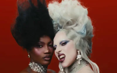
The primary source of the controversy is the album’s official cover art, which critics claim lacks the professional polish typically associated with a major label studio release.
The design features a specific set of visual elements that have been labeled as “flat” and “unpolished” by design observers:
- The Concept: An image of a hand giving the middle finger, where the finger itself is an image of Lizzo.
- Color Grading: The use of greyish hues and heavily decreased saturation.
- Execution: Fans have pointed out the “sloppily pasted-on” appearance of the mini-Lizzo figure.
- Tone: An attempt at edgy imagery that critics say feels like it is “trying a little too hard.”
Industry analysts have noted that while the best album covers often break traditional formulas, Lizzo’s latest design is being panned for its “empty provocativeness” rather than artistic innovation.
Fans and Social Media Users React to the Announcement
Social media platforms have been flooded with commentary from disappointed fans who feel the artwork does not match the quality of Lizzo’s previous work.
Even loyal supporters have been seen raising their eyebrows at the aesthetic direction, with some calling the creative concept “a choice” that they fail to understand.
One fan commented directly on the reveal, stating, “Lizzo I love you but this cover is terrible,” while another added that they found the design to be one of the “worst” they had ever seen.
Professional Critics Label Design “One of the Worst”
The critical response has been equally scathing, with professional reviewers and design outlets weighing in on the unpolished feel of the BITCH album era.
One critic scathingly wrote, “I’ve never seen such a tacky album cover and title,” reflecting a broader sentiment that the project may be missing the mark of an iconic music release.
The backlash suggests that edgy imagery alone does not guarantee a successful visual identity, especially when the execution is perceived as amateurish or intentionally unappealing.
Comparison to Other Controversial Album Art Trends
This controversy places Lizzo in the company of other high-profile artists who have faced public scrutiny for their visual branding and marketing strategies.
The current landscape of the music industry has seen several instances where fans questioned the quality of creative output:
- DIY Aesthetic: Fans previously compared Harry Styles’ album art to a “DIY job.”
- Alternate Covers: There is a growing concern that the “alternate album art” trend has gone too far.
- Provocation vs. Quality: A debate over whether “could-not-care-less” attitudes result in genuine art or just poor design.
Lizzo’s team seems to be leaning into this “could-not-care-less” attitude, potentially as a deliberate marketing ploy to match the defiant nature of the album title.
Technical Details and Industry Impact
Despite the negative reception of the cover art, the announcement has successfully kept Lizzo at the center of the cultural conversation, a hallmark of modern pop star marketing.
The album title BITCH is seen as a bold statement of the singer’s provocative attitude, even if the surrounding visual elements are currently being slated by the public.
Whether the music itself will transcend the initial “tacky” impressions of the artwork remains the biggest question for the upcoming release cycle.
Summary of Public and Critical Response
| Group | Primary Feedback | Common Adjectives Used |
|---|---|---|
| Loyal Fans | Mixed; mostly confused by the creative “choice.” | Terrible, Questionable, Edgy |
| Music Critics | Scathing; focused on poor technical execution. | Tacky, Worst, Unpolished |
| Design Observers | Disappointed by the “flat” greyish hues. | Bland, Sloppy, Amateur |
As of now, Lizzo has not officially responded to the wave of criticism regarding the artwork. The singer appears to be moving forward with the project’s original vision, despite the vocal dissent from her audience.
The situation serves as a reminder of the high expectations placed on major artists to deliver cohesive and professional visual identities alongside their musical announcements.